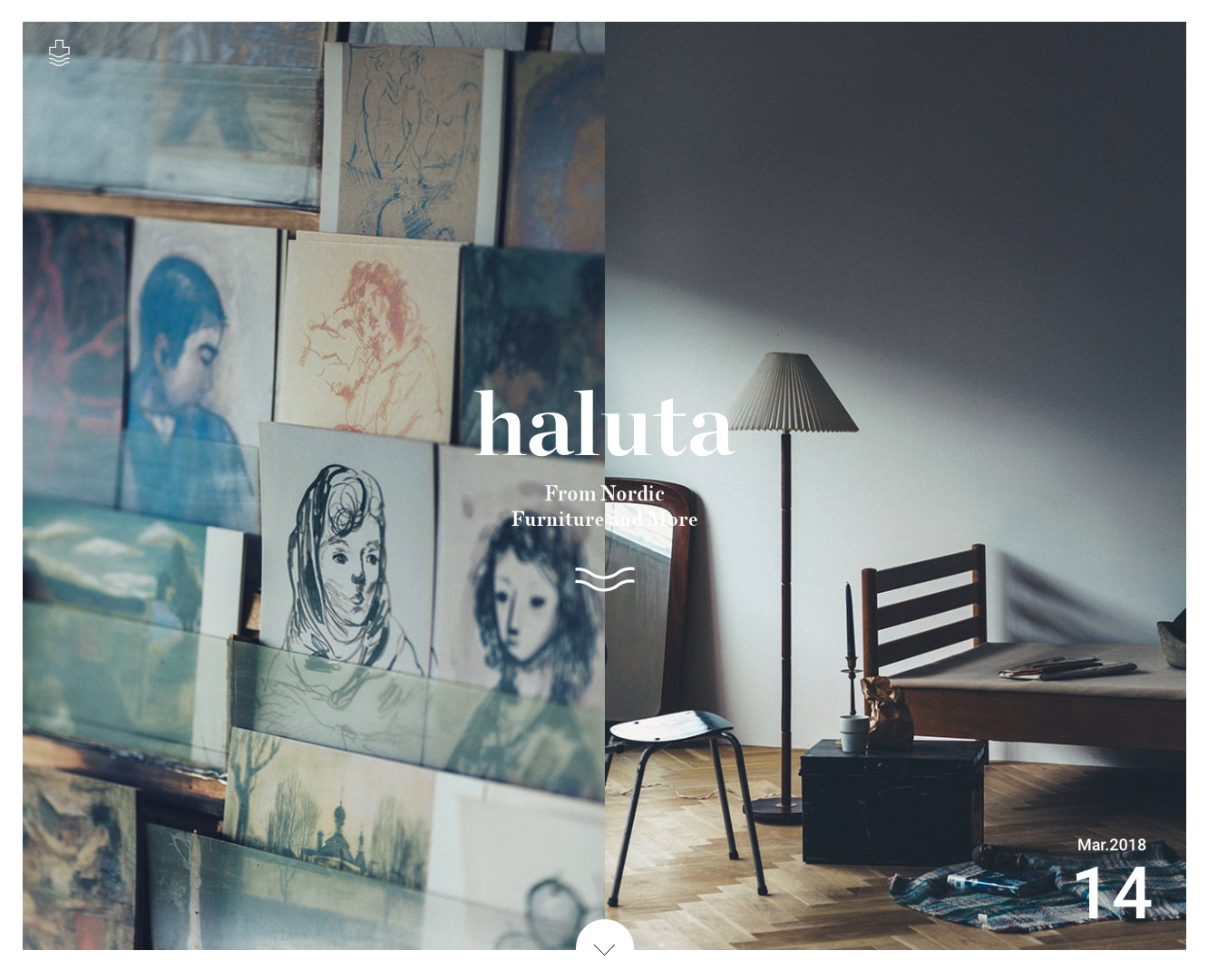
http://www.haluta.jp/ 2枚のメインビジュアルがスライドしていくの面白いですね。 左右の画はお互いがつながっている感じがします。 ビジュアルによるメッセージを伝えたい時に良い手法かなと思いました。参考…
美術的
シンプル
haluta | ハルタ
ナビゲーション
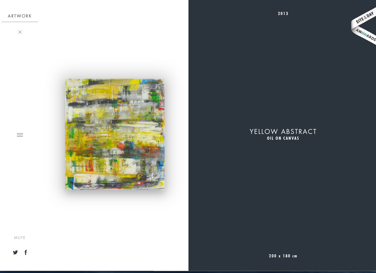
Habib Fadel
http://www.habib-fadel.com/en/artwork/1249-yellow-abstract.html 最近こういった画面2分割サイトを良く見かけます。レイアウトの流行りなのでしょうか。 サービス…
ナビゲーション
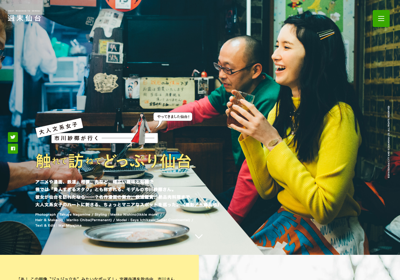
週末仙台(仙台市観光・旅行ガイドサイト[旅・おみやげ・グルメ・おすすめスポット])
http://weekend-sendai.com/ichikawa.html レイアウトが面白いサイトですね。Webマガジン系サイトの参考にさせていただきます。

ナビゲーション
TURN|アートプロジェクト
http://turn-project.com/ これはなんだ。面白い。BGMってありですね。マウスオーバーしないとコンテンツが現れないもどかしさ。イライラするけど、斬新ですね。
すっきり
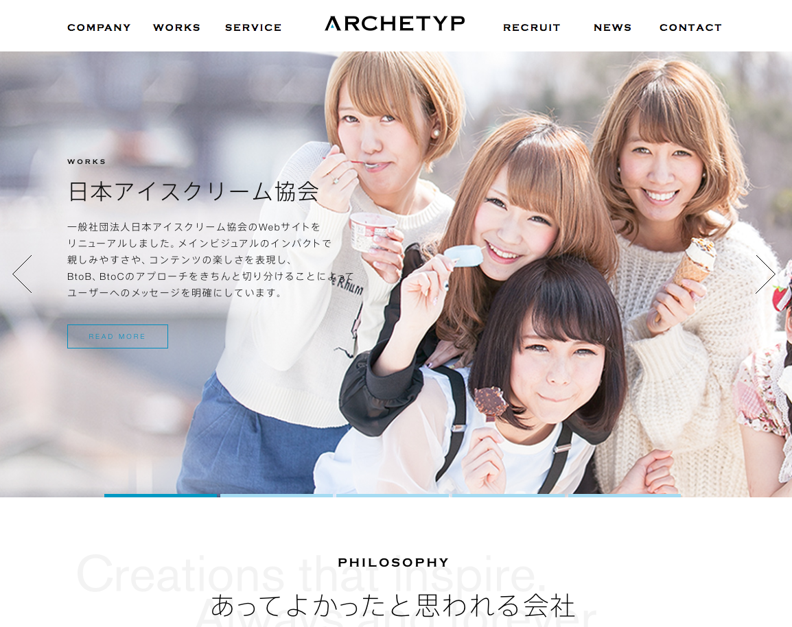
ARCHETYP Inc. | 株式会社アーキタイプ
http://www.archetyp.jp/ 画面遷移させる際の演出が面白いですね。進むときは手前に、戻る時は奥に。確かに、これであればWeb上でも画面の切り替わりを意識させることができますね。うまいです。ニュースもラ…
すっきり
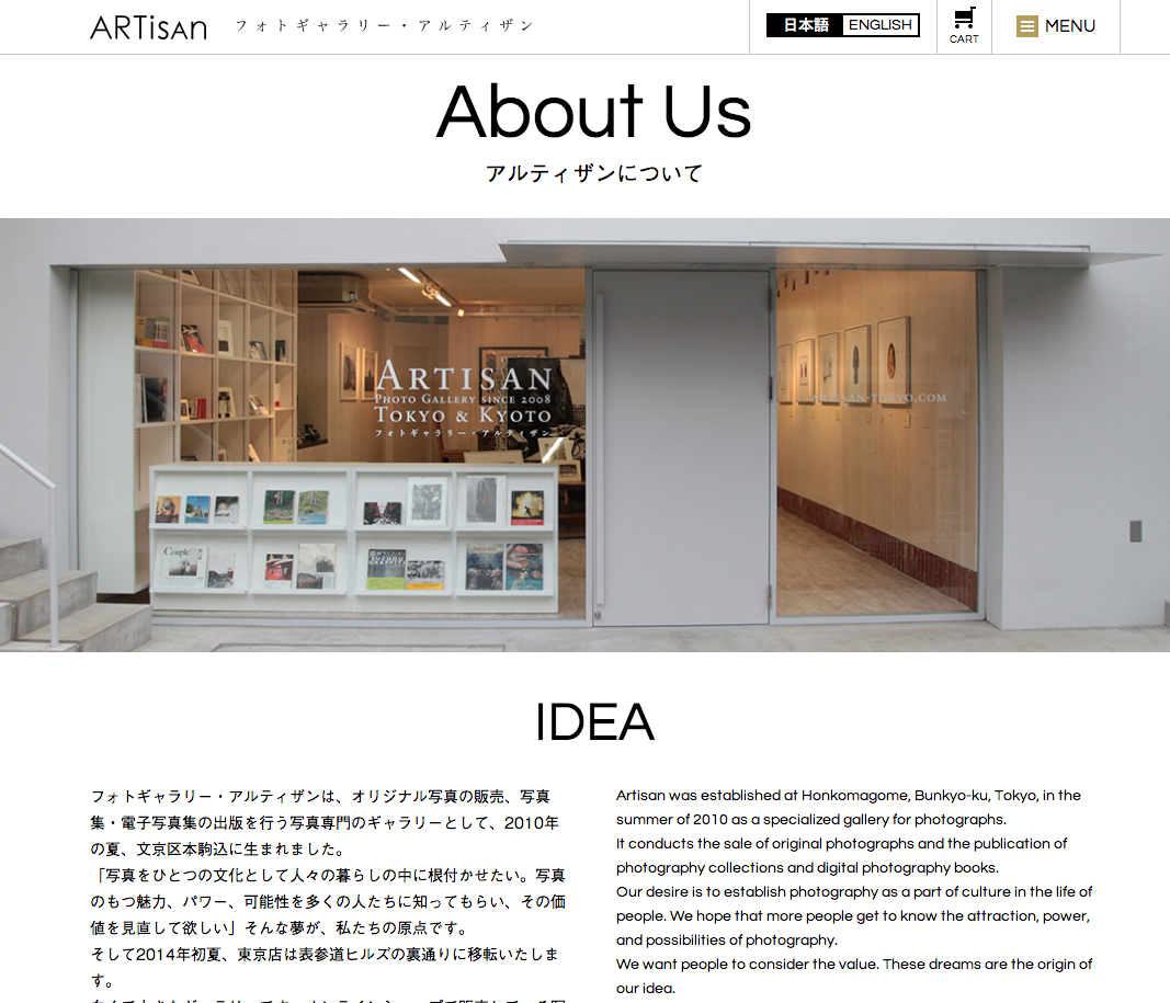
Photo Gallery ARTisan
http://www.artisan-tokyo.com/about/ 黒白でまとまっているサイトで綺麗ですね。ブランド紹介だけでなく買い物も出来てしまうサイト。日本語と英語を左右に並べて表示させるのもいいですね。
EC/EC-CUBE
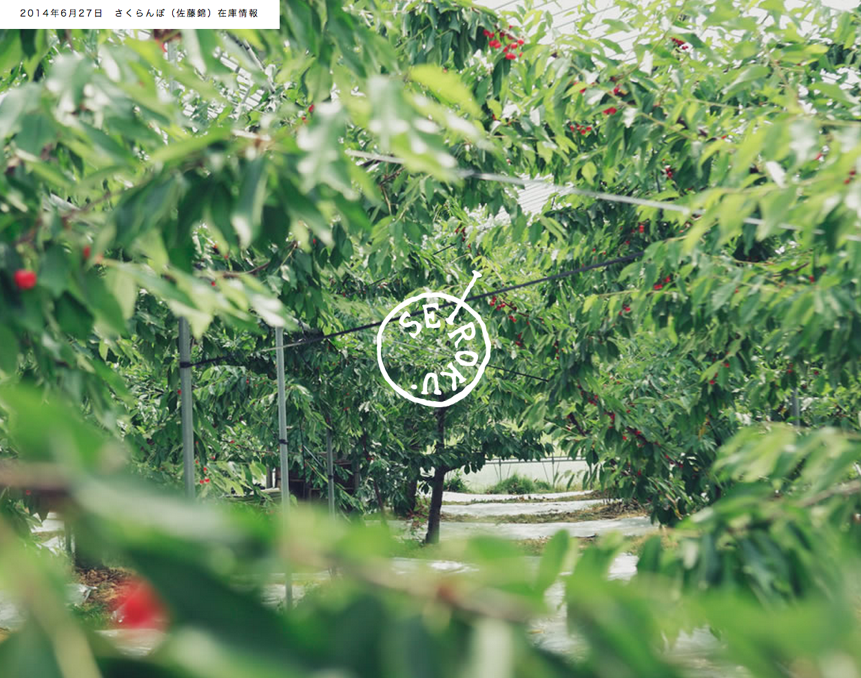
山形 南陽 清六ファーム
http://www.seirokufarm.com/ いさぎがよいデザインですね。結構好きです。写真のクオリティも高いですね。雰囲気でてます。ホームページっぽくない写真ですけど、これはこれで面白いです。そして実はネット…
ナビゲーション
Fixed Digital Agency
http://fixedagency.com/最近、スマートフォンとPCサイトの垣根をとってしまうデザインのサイトをよく目にしますが、こちらの会社さんもそうなのかな。レスポンシブ化する必要がないので、ある意味このほうがい…
シック
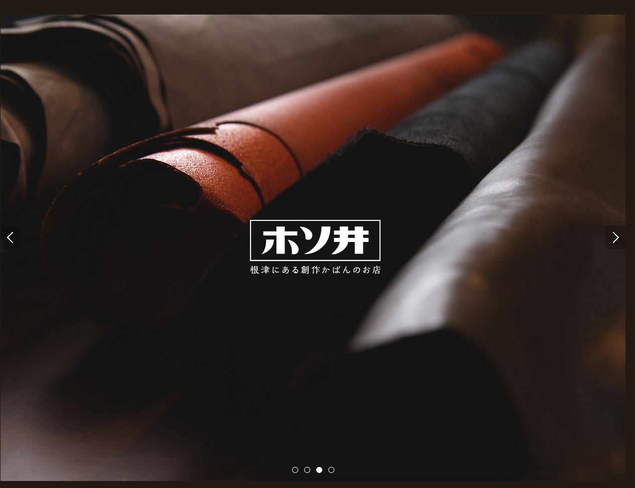
創作かばん ホソ井
http://kabanhosoi.com/ ホームページにイントロダクションをつけるサイトは大抵へんてこなものが多いのですが、こちらのホームページは出だしが上手ですね。写真のクオリティも高いということなのだと思いますが…
シック
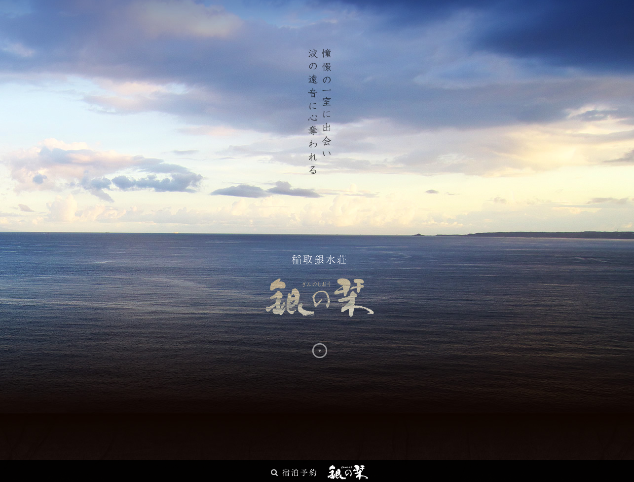
稲取銀水荘
http://www.inatori-ginsuiso.jp/ginnoshiori/ こんな風に写真に奥行きを出す手法としてパララックスを利用するのは面白いですね。参考にしたいです。

ナビゲーション
We Are Visual Animals
http://wearevisualanimals.com/ 面白いナビゲーションですね。でっかいlightboxって感じでしょうか。なんとなく直感的に操作がわかるのでいいですね。
EC/EC-CUBE
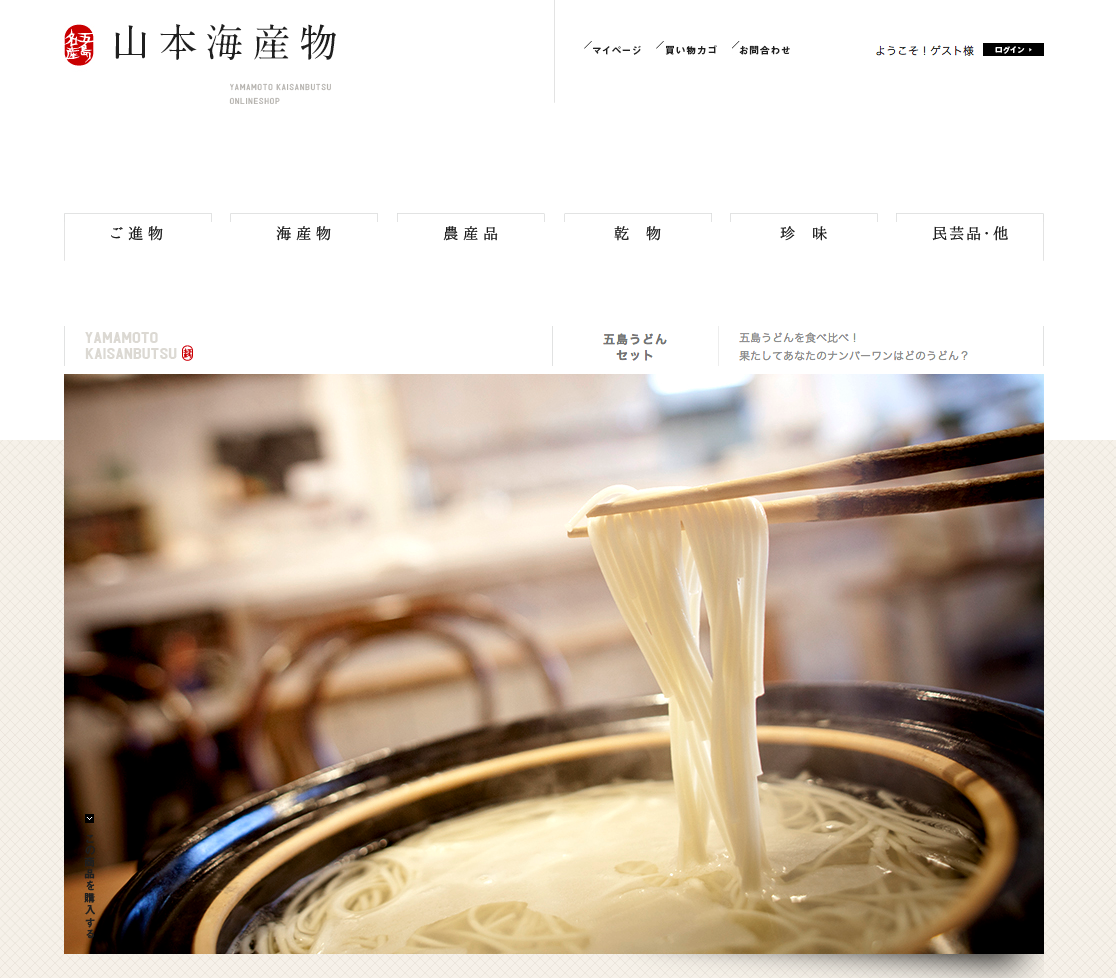
山本海産物オンラインショップ
http://shop.yamamoto-kaisanbutsu.jp/ 写真がすごいですね。シズル感を通り越して、芸術の域に達してますね。一つ一つの商品に、完成度の高い写真を用意しているってところがすごい。なかなかでき…
HTML
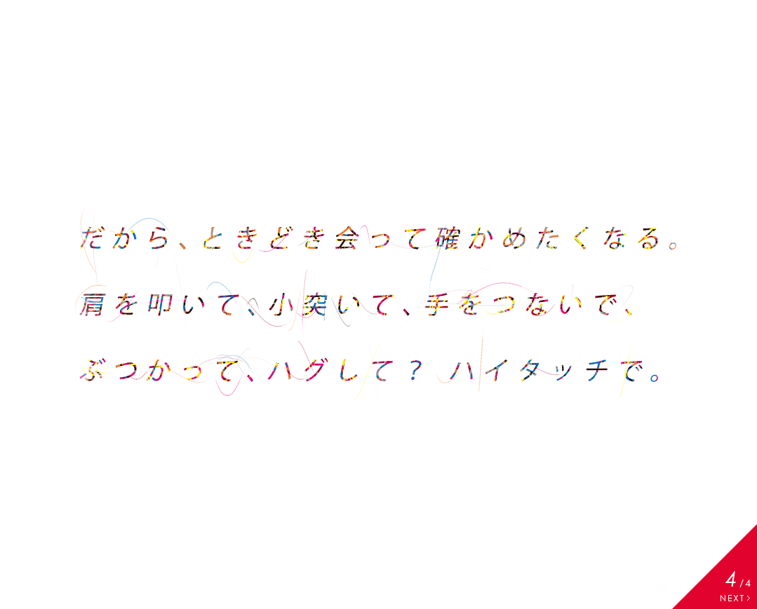
New Balance Japan
http://www.newbalance.co.jp/tsunagare/HTMLだけでこんな風に表現できるってなんかすごいですね。おもしろい。どこか芸術的な感じもします。
ナビゲーション
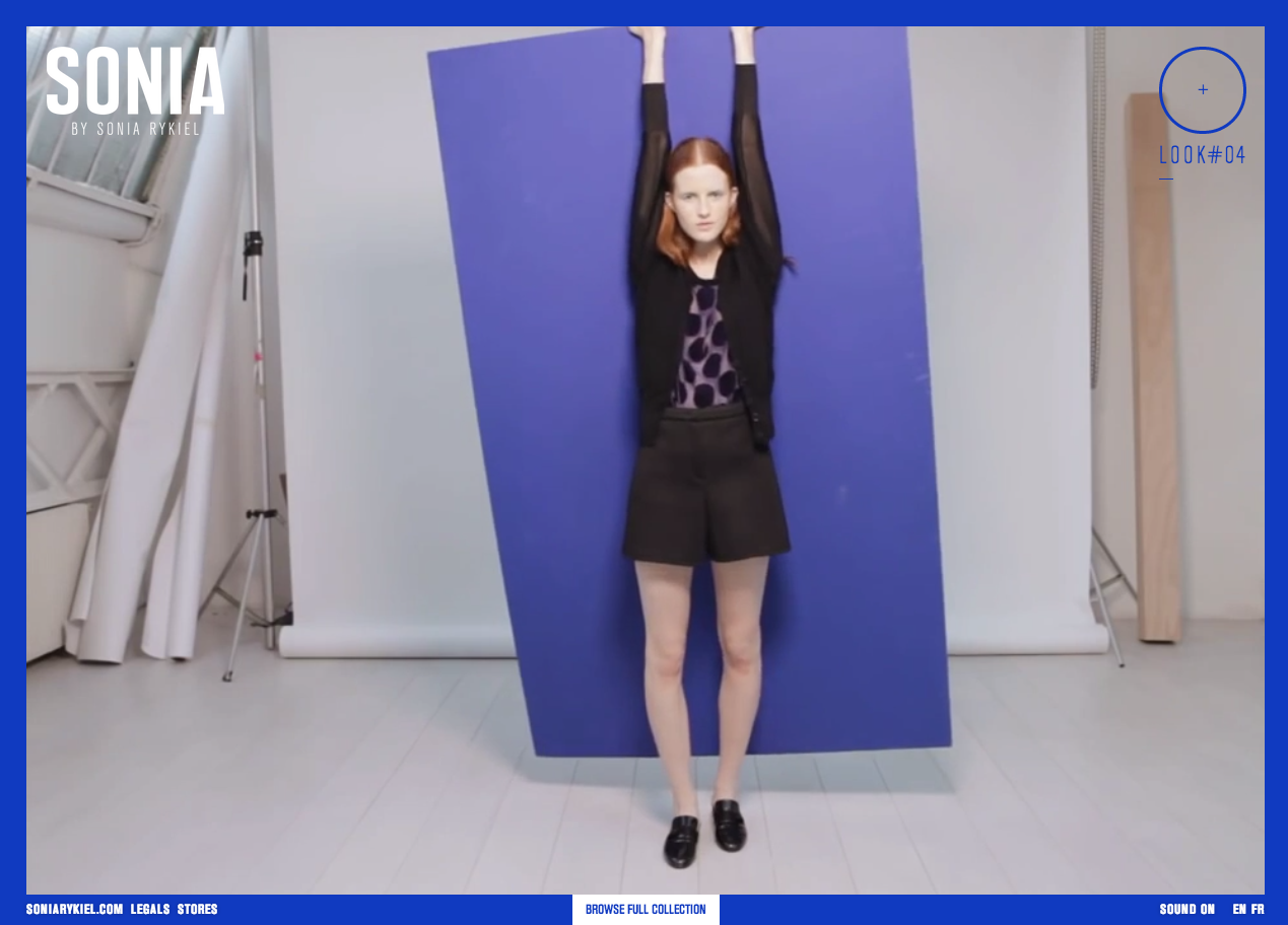
Sonia Rykiel Fall Winter 2013
映像を使った商品紹介の方法が斬新。どこか芸術的な感じがするのは写真と映像の雰囲気からかな。http://www.soniaby.com/en/
デザイン
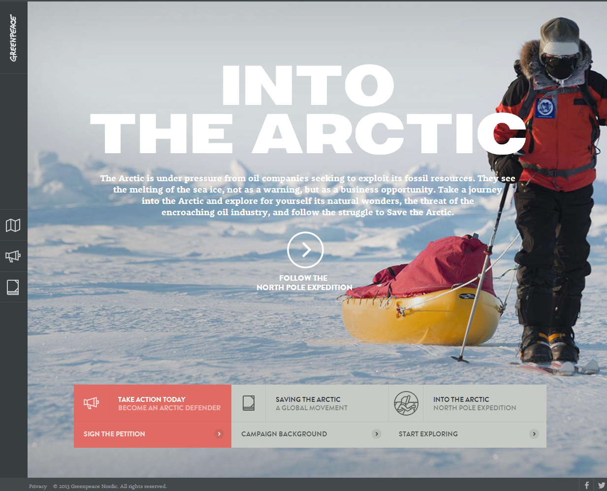
Into the Arctic | Greenpeace
http://intothearctic.gp/#/ナビゲーションの手法やアイコンによるボタンの見せ方が面白い。ちょっと重たいけど2画面レイアウトも参考になります。
シンプル
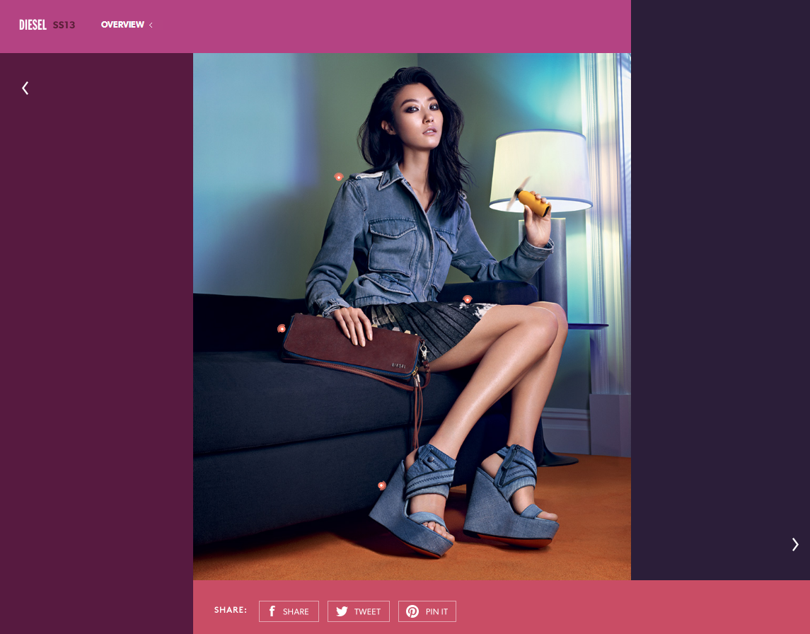
Diesel – Spring Summer Campaign 2013
http://www.diesel.com/campaign/#/2http://www.diesel.com/campaign/#/4ナビゲーションのさせ方が面白い。一昔前はFlashでよく見かけましたが、最近はHTM…

HTML
Kenji Saito
http://kenji-special.com/すごいですね。Flashを使わなくてもできるんですね。
ナビゲーション
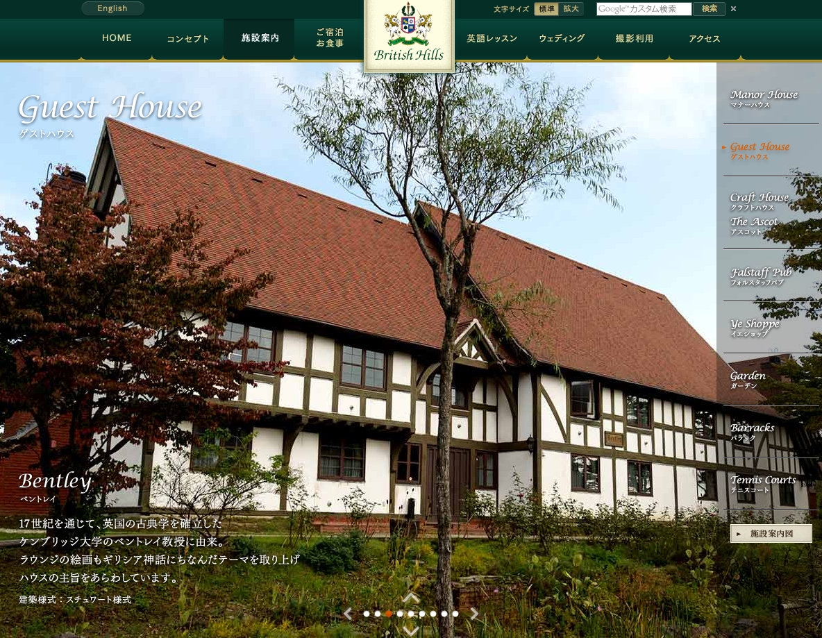
ブリティッシュヒルズ
http://www.british-hills.co.jp/establish/ 写真メインでサイトを表現する方法として参考になります。面白いナビゲーションですね。
シンプル
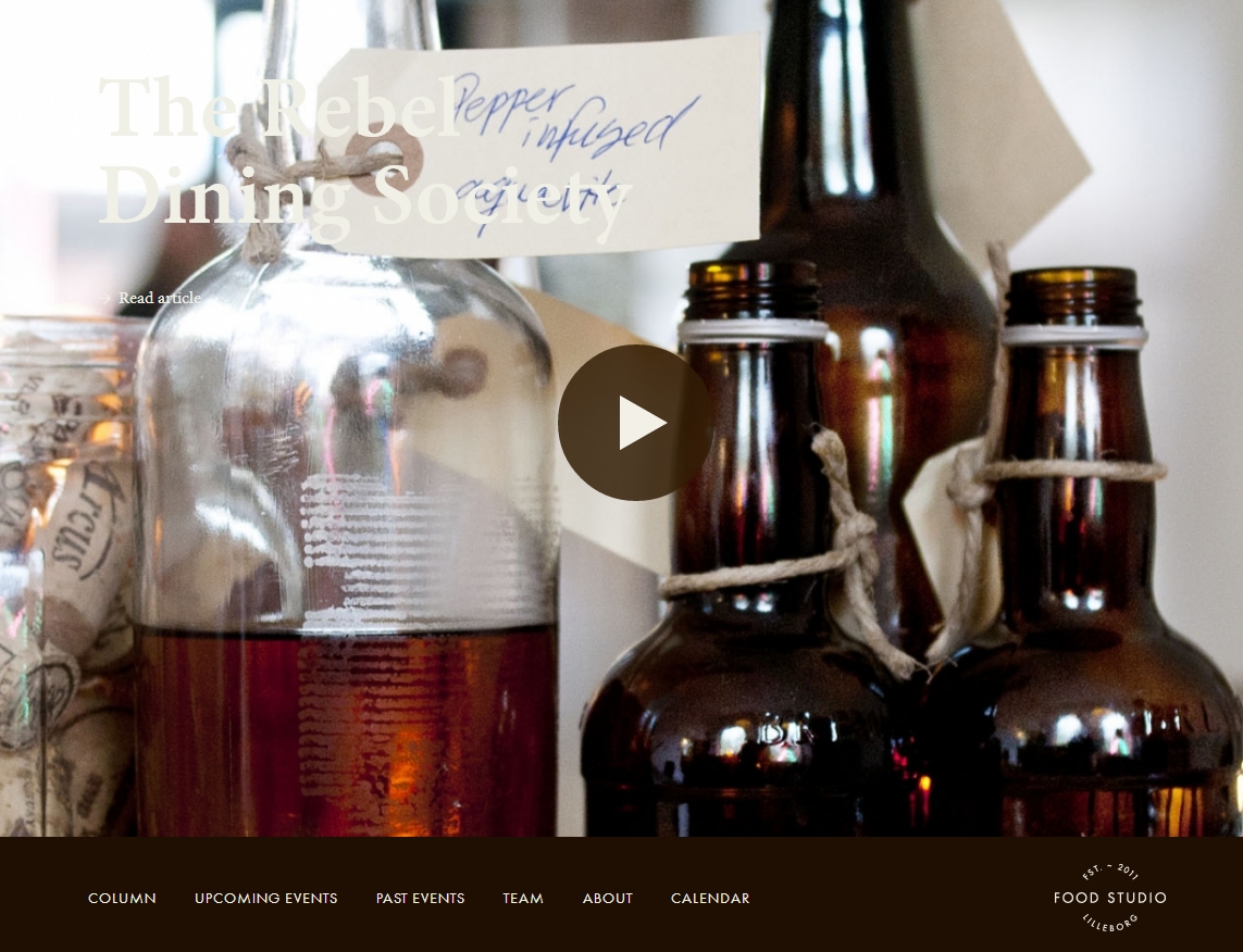
Food Studio
http://foodstudio.no/ 食をプロデュースするノルウェーの会社さんなのかな?サイト内のコンテンツが良い感じ。ビデオも写真も、イラストもクオリティ高いなぁ。 食べ物やら、食器やら、台所用品が、いちいちおし…
すっきり
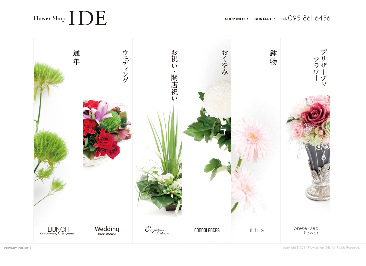
長崎市岩見町のフラワーショップいで
http://www.fs-ide.net/ 綺麗なサイトですね。いいです。 雰囲気出てます。
Flash/AR
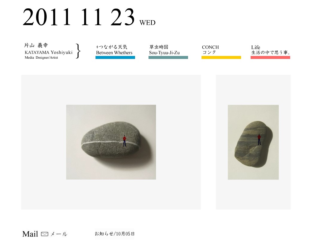
ktym
映像系のコンテンツなんですが、面白いです。 「時間」というテーマ好きです。 http://ktym.jpn.org/index.html
すっきり
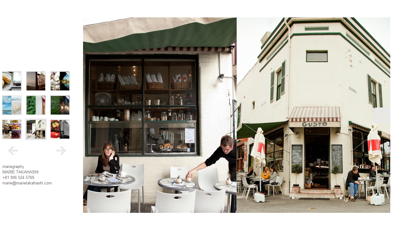
mariegraphy
蟹味噌さんに教えてもらいました。 どれも雰囲気のある写真ですね。良いです。 http://www.mariegraphy.com/
ネタ/所感
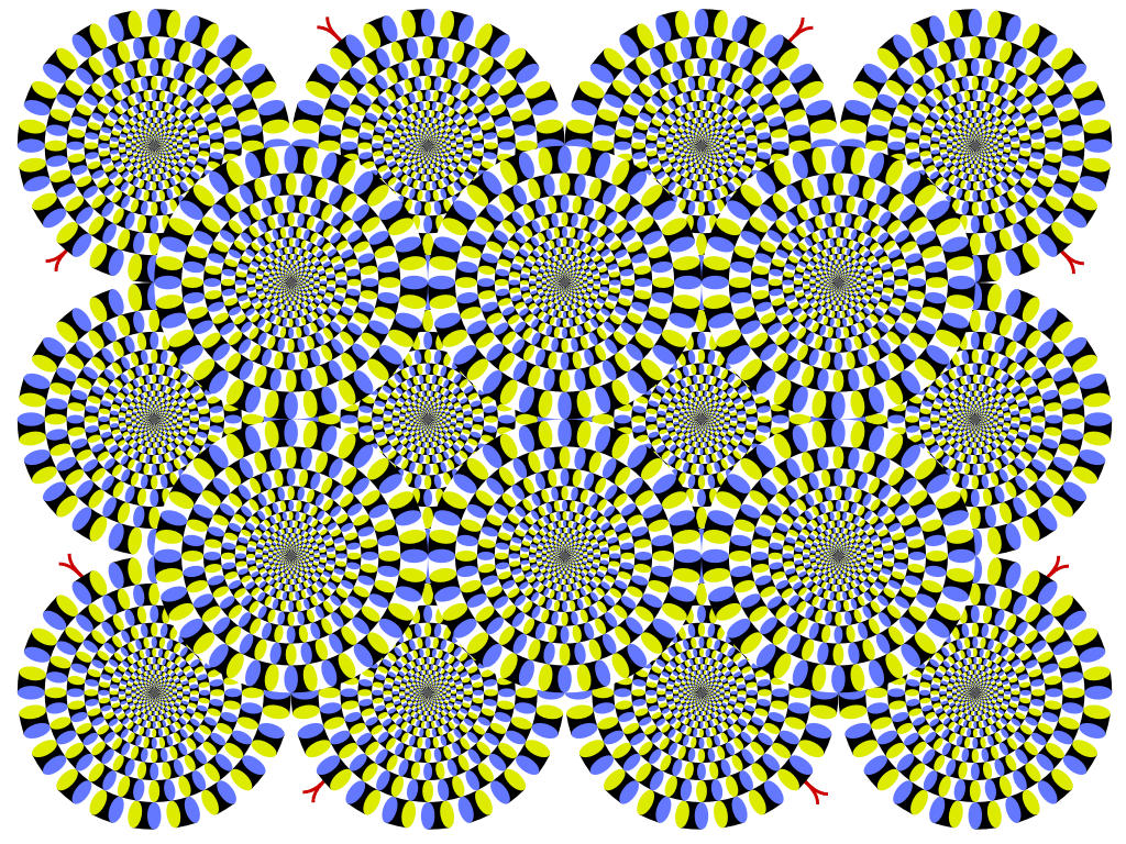
おー動いてる
ずっと見てると酔います。 人間の目ってやっぱり不思議。ぜったい動いてるんだけどなぁ。止まってるんだよね。
Twitter/Youtube
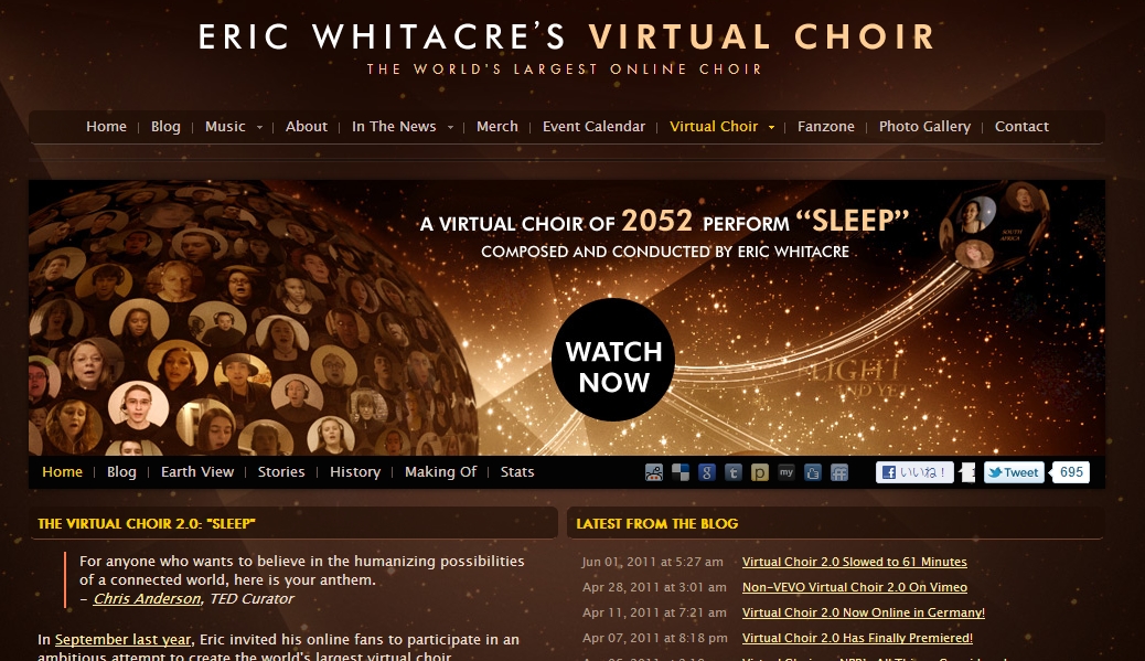
Eric Whitacre’s Virtual Choir
おーこれは壮大だな。ネットでつなぐコーラスってことかな。 インターネットの可能性がまた広がるね。 http://ericwhitacre.com/the-virtual-choir
.png)
Flash/AR
むしやしない処 仁々木
http://ninigi.co.jp/ 京都いいね。 店舗の紹介サイトかな。 今なら、Flash使わなくてもできるのかな。iPadから見ることもあるしね。
ナビゲーション
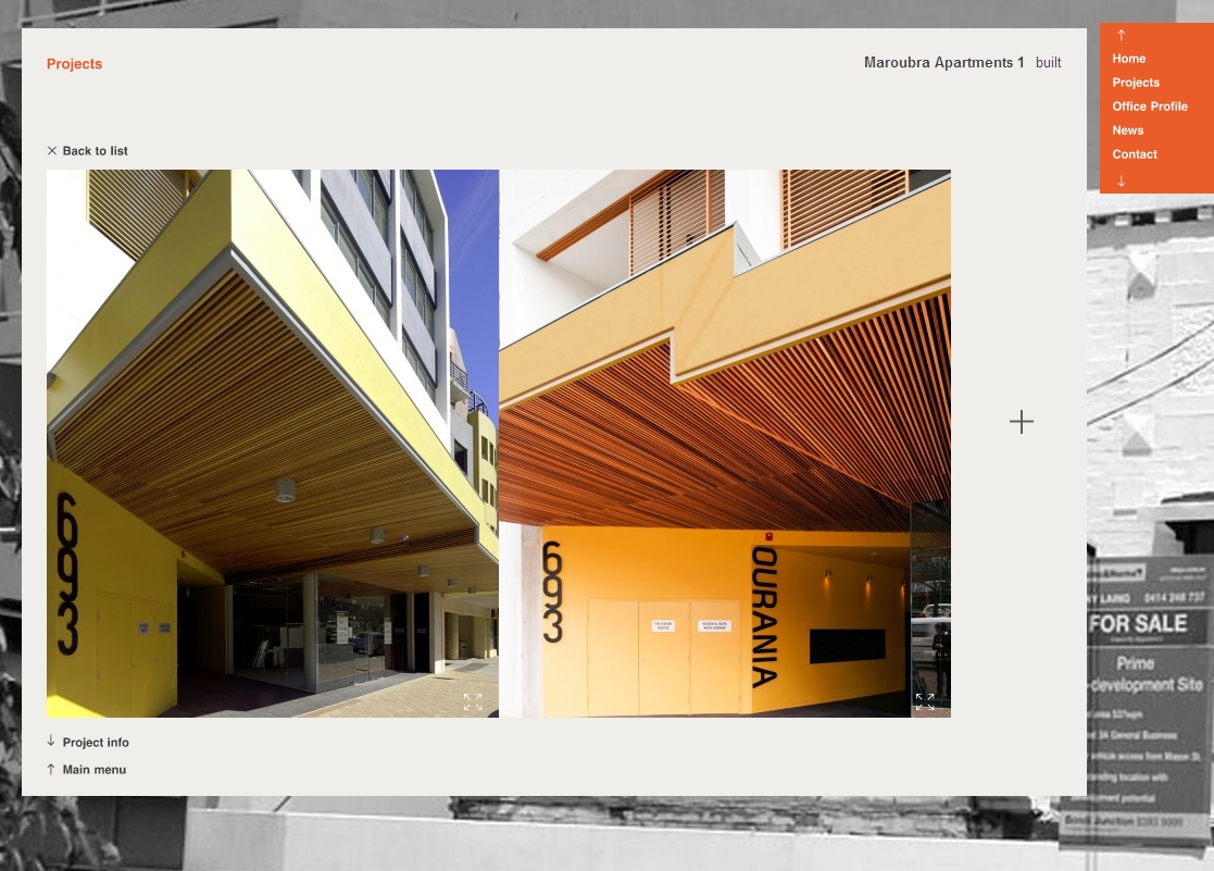
Fox Johnston
http://www.foxjohnston.com.au/main.php#/project こちらもナビゲーションが面白い。写真なんかを見せる場合には確かに邪魔にならないのに便利だからいい感じ。
クール
BABALOO DISCO . Official Website
http://www.babaloodisco.it/#/home 操作性がむちゃ悪い。でも嫌いじゃない。
HTML
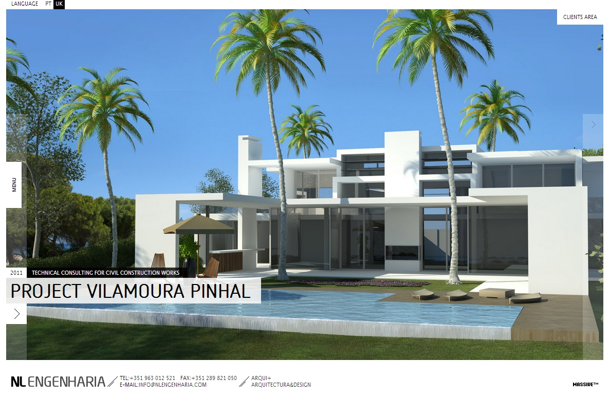
NL Engenharia
http://www.nlengenharia.com/en Flashのようで、Flashではない。今後こういった技術がスタンダードになるのでしょう。
イラスト
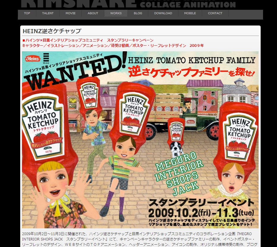
MEDIA WORKS
http://www.kimsnake.com/works.html どこかでみたことがある画風ですね。個性的です。